Introduction to me

My name is Shayam Utting, 9163, and I am in group 1 with Amber Mota, 9114, and Alistair Price, 9137.

To navigate your way around my blog, please use the labels below; A2 Research and Planning, A2 Construction and A2 Evaluation.


'Trip Switch' by Come What May

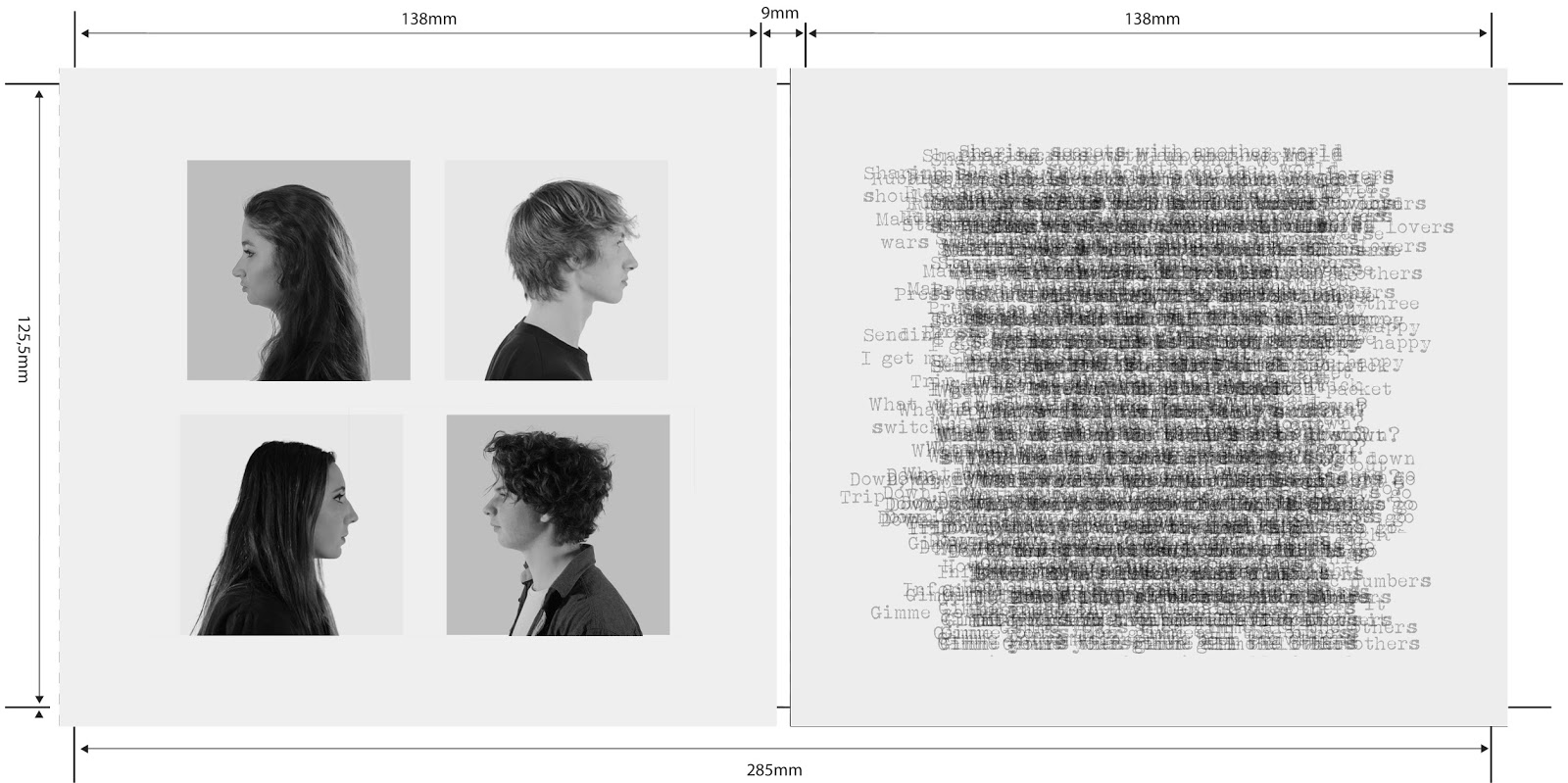
The outside of our album cover

The outside of our album cover
Front of Our Digipak

Digipak

Digipak
The Inside of Our Digipak
Our website, please click on it to access.

Tuesday, 21 October 2014

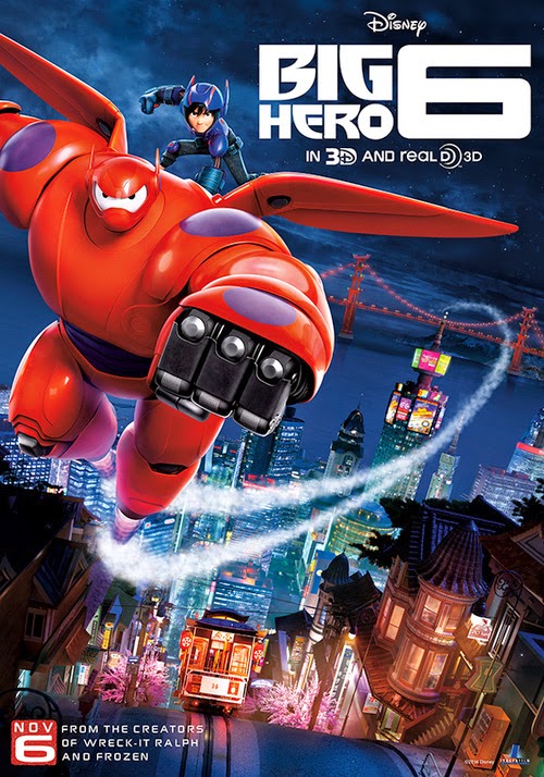
Big Hero 6 case study introduction

 
1) Film genre and type of production? 
'Big Hero 6' consist of the genres comedy, adventure, action animation movie. It has been rated PG, it's a high budget Hollywood production that's high concept with a big status. It will be seen as an 'event movie' and will be released in 3D.
-Official website.

2) Whats the film about?
The special bond that develops between plus-sized inflatable robot Baymax, and prodigy Hiro Hamada, who team up with a group of friends to form a band of high-tech heroes called 'Big Hero 6'.  This is seen in the trailer and found on the marvel website. We see that the main themes are about fighting crime, friendship and coming-of-age.

3) Global and UK release dates? Where and what formats? 
In the US the film is released on the 7th of November 2014 and the 30th of January in the UK as theatrical releases. It will have a staggered release worldwide between the 23rd of October 2014 at the Tokyo International Film Festival and the last release is in France on the 11th February in 2015. The movie is relying heavily on positive word of mouth and no plagiarism. On the official website there is also a countdown to the release in America which is informative and attention-grabbing.

4) Nationality of the film? 
The film is American but was initially set in Japan but has been Americanized for example with the name 'San Fransokyo'.- Wired online article

5) Institutions behind the film's production and UK/US distribution? Where are they based? 
Disney Animation Studios, Walt Disney Motion Pictures and Marvel produced the film and a very small percentage was sold to a Hungarian distributor. The film was vertically and horizontally integrated as many of its institutions were global corporations as a way to reach and appeal to people all over the world, they did this by advertising the film in Disney stores, using their app and on the official website. On their Facebook page there were also many competitions and sneak peeks of the movie, such as their inspired art competition or the chance to win a trip to LA to see the premier.

6) What's the film's production budget? 
The film will be high budget and financed by Disney, we are estimating about $200 million will be spent on the making of this film.- Big Hero 6 Wikepedia & the Disney Animation website.

7) Any connection with other films? 
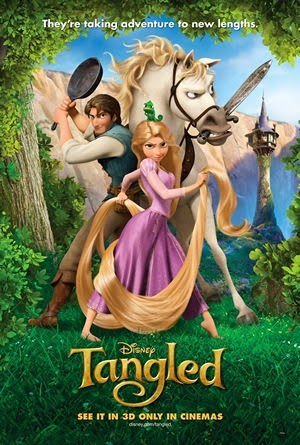
The production companies also produced 'Frozen', 'Wreck-it Ralph' and 'Tangled' which was also promoted in the trailer

8) Who's the director?
Don Hall and Chris Williams are the directors of this film, Don Hall is a free-lance worker who also helped produce 'Tarzan', 'Brother Bear' and 'Princess and the Frog'. Chris Williams is a staff of Disney who also co-produced 'Bolt'.


9) How has the film been cast? Who's in it?
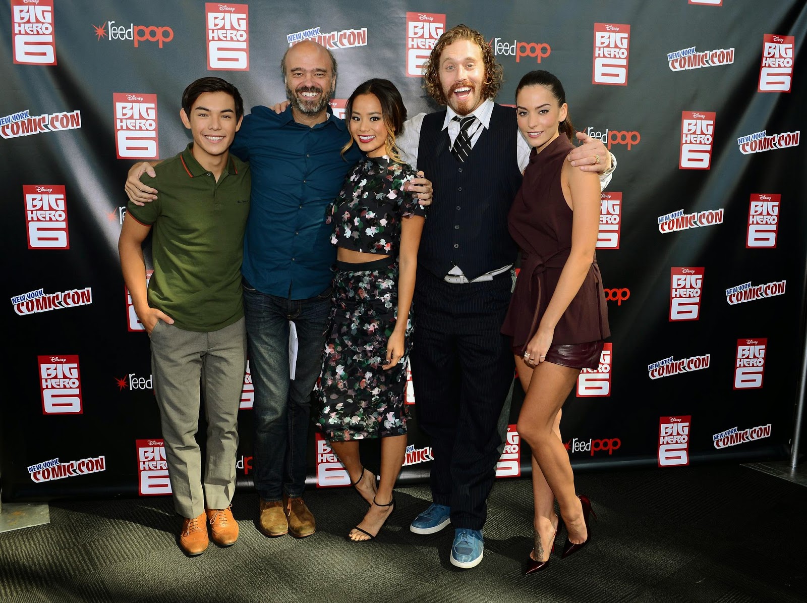
All of the actors who have been cast are big American or Japanese actors and is predominantly male, these consist of:
- Genesis Rodriguez- singer actor and model
-Jamie Chung-actor
- T.J Miller- comedian
-Alan Tudyk- actor
-James Cromwell- theatre actor
Big Hero 6 wikipedia page.


10) Core audience? Secondary/tertiary markets?
The core audience for this film is families and younger children but also parents as it includes adult humor.  Fans of Disney and Pixar-style movies are also core audience. Secondary audience's would be teenagers and fans of action/marvel movies. The tertiary audience consists of fans of big event movies and people who are going on a family day out and also fans of children films. 

Sunday, 12 October 2014

The Knife That Killed Me case study intoduction


1) Film genre and type of production?
The film is a teen thriller and drama movie. It is being produced by Green Screen Studios which is a a small, independent production company in Yorkshire. It is a low budget film that has been rated a 15 due to violence in scenes and reference to oral sex and swearing.

2) What's the film about? 
Knife crime, teen gang violence, rivalry. It is based around a teenage boy who becomes involved in knife crime and must decide where his friendship lies. This decision could cost him his life.- Youtube.

3) Global and UK release dates? Where and what formats? 
The film is being released on the 24th of October, 2014 by video on demand and DVD but will also be able to be streamed online by a global audience. There will be no theatrical release but there was an online premiere and release at the National Media Museum. They also had a live stream of Q&A with the directors on the 27th July which they advertised on their Facebook page. The film was also shown in the official selection of 'Alice nella Citta' film festival, an indie youth sidebar of the Rome Film Festival. The screenings are taking place from October 17th-19th. They also held a charity event at the Literally Coventry book festival and their was a free movie screening at the Museum of Science and Industry in Manchester on the 15th of July 2014.-The Knife that Killed me Official Website.

4) Nationality of the film?
It is a a British film that has a British cast and British directors, it was also filmed and produced in Green Screen Studios in North England.

5) Institutions behind the film's production and UK/US distribution? Where are they based?
The film is an independent British film produced by Yorkshire studios, it's distributed by Universal pictures situated in London (UK), and Focus Features (US). It is supported by Stealth media, a Brighton group and the distribution of the VOD and DVD was by Universal Studios.-Film review.

6)   What's the film's production budget?
£3 million and it was supported by Gloucester Place Films, Matador pictures and Premiere pictures. They used Kickstarter to appeal to the public to sponsor them, their aim was £20 000 and they achieved £20, 094.

7) Any connection with other films?
The film has synergy with the book and Green Screen studios have also referenced the same style as famous films such as '300' and 'Sin City'.


8) Who's the director?

Kit Monkman and Marcus Romer. Monkman is a theater director and also wrote the screenplay for this film. Romer is a published playwright, director and actor.


9) How has the film been cast? Who's in it? 
The main star of the film is Jack McMullen who was on Waterloo Road and has a national reputation for British TV. All the actors in the film have a small scale, little profile which supports the British industry.

10) Core audience? Secondary/ tertiary markets? 
The films core audience is teenagers, people who enjoy thriller or horror. It is aimed at a modern audience, young adults and particularly people living in Yorkshire, British people, fans of the books and indie film fans. There was an article in the Evening post on the film to raise awareness and at Yorkshire University it was mentioned in their magazine to appeal to the students and also because the special effects were done there. This would help support the local economy.

Friday, 3 October 2014

Prelim evaluation

Synopsis:  Geek vs Chic-two girls battle it out to decide who gets to wear the t-shirt that they both love so much.

1) Who did you work with and how did you manage the task?

I worked with Godgift and Amber to produce this prelim.
As both myself and Gift were acting, most of the shooting was done by Amber although if the shot was of just one of us we would aid Amber and help direct. We came up with the synopsis together but for the editing Amber worked separately and I worked with Gift. We each did some planning over the weekend, I produced the shoot board, Gift drew it out and Amber wrote the script.

2) How did you plan your sequence? What processes did you use? What theories did you try to take into account?
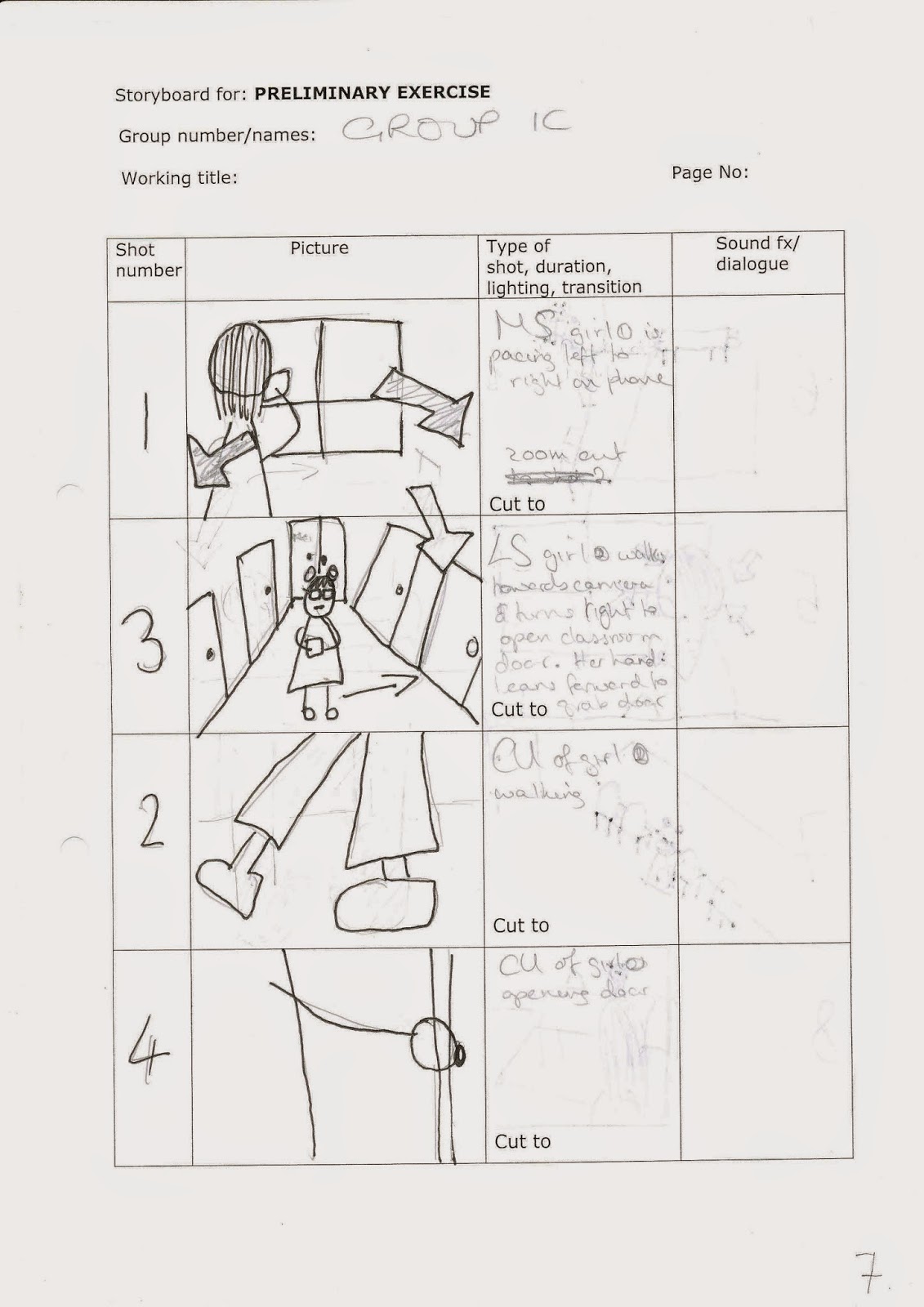
We planned our sequence by firstly brainstorming ideas for a synopsis and then creating a storyboard and shooting schedule. We focused on three main theories; continuity, genre and narrative theory. Our storyboard helped us in creating a logical order of shots when editing even though when shooting we did not stick to it completely.
We also took into account:
- the 180 degree rule to help the viewer make sense of the scene although this was quite tricky to do and we had to retake a few shots because we would sometimes cross this line
- Jump cuts were not included and we tried to use a variety of frames.
- The eye line match helped vary the frames as one of our characters was standing up and the other sitting down so we got to film from different angles.
- We used a shot/reverse/shot which was not as difficult as I thought it would be to edit but we could have got a more clear master shot that would have shown both characters.
- Match on action was quite tricky to achieve but I think we did quite well and included quite a lot in our prelim.
We connoted the drama/comedy genre quite well I think as the characters are clearly disputing and juxtapose each other via the narrative. We left the audience wondering what will happen next after starting with an equilibrium of the girl talking about a party she's attending but then being disrupted by a geek copying her style.

3) What technology did you use to complete the task, and how did you use it?
 We used the Canon Legria HFG30 to film our shots and placed it on our tripod and used a microphone to capture the sound more clearly. This was a really good camera to use as it's very good quality and it was easy to pan with and zoom in or out.

To edit we used software called Adobe Premiere Pro which we have used before so it was quite easy for us to edit although we had to be a lot more careful and consider where to cut the shots so that continuity was achieved.


4) What factors did did you have to take into account when planning, shooting and editing?

We had to consider props, lighting and placement of camera in particular as these were all limitations. When filming we forgot to consider what could be seen in the reflection of the glass and so we got some shots with Amber filming in the background by mistake. The 180 degree rule was one of our biggest concerns as it was really difficult to not want to move the camera across the room and shoot from different angles.We did not have time to set up any lighting but I don't think this was a massive issue as we shot on bright days. We didn't use many props but we did have to bring:
- The same t-shirts
-Folder for the geek to carry
- A phone which the chic used
- A hoodie for the chic
Timing was also very important as we had to limit our time for each section of the prelim and shoot and edit within our lesson time. When editing we also made sure to alternate equally between myself and Gift so that neither of us was putting in more effort than the other.

5) How successful was your sequence? Please identify what worked well, and with hindsight, what would you improve/do differently?
We achieved our task to get someone into a room, walk across it and have a discussion with another person. We tried to stick to all the rules that would achieve continuity and I think our sequence was quite successful, we used a range of theory we had learnt about and we kept in character well. We used a range of shots and different angles including a master shot to set the scene. For the geek vs. chic we tried to use mise-en-scene to create juxtaposition between the two characters, the chic was in a hoodie and biker boots on the phone to her friend where as the geek was carrying a bright pink folder and doing her maths homework alone. We also conformed to the 180 degree rule very well but at first we did not follow this so in hindsight I would have prepared for this so as not to waste time re-shooting. I would have also chosen to follow it from a different angle so as not to have Amber's reflection in the mirror. I think our shot/reverse/shot worked very well and the match on action when both chic and geek entered/exited the classroom. The beginning of our sequence was not as well edited as I had thought and in hindsight we could have tried to work with lighting and we should have brought the same props for both days as we had to change some of our shots because they did not have continuity. We also could have chosen our setting more carefully so no reflection was seen in the glass.

6) What have you learnt from completing this task? Looking ahead, how will this learning be significant when completing the rest of your foundation coursework, do you think?
 I have learnt that transitions between shots are very important and jump cuts are an easy mistake to make. I have also learnt that it takes time to get the right shot and it is best to take as many shots as possible from different angles to give myself more footage than needed rather than less. In the future this will be helpful as I can learn from these mistakes and make sure to use all these continuity features that I have learnt about. This has been good practice and I have developed my skills greatly. Next time I would also like to do some of the filming but I did enjoy acting and directing. We can also plan our time more efficiently next time and include more master shots. We also didn't use the clapper board very much or check the lighting and sound so next time we would make sure we did this which will also make editing shots a lot easier. We also could stick to the storyboard to make our lives more easier and editing would be more ordered and logical.

Saturday, 27 September 2014

Evaluation of AOTT activity


Synopsis:

Our film's genre is crime thriller titled 'MINE'. The synopsis is that a detective is in search of his girlfriend who gets kidnapped, the film follows his journey in parallel to hers. He eventually finds her and they get married.

In our film opening it introduces the victim- the stereotypical damsel in distress. It also introduces the villain who is in fact hidden by a mask which is a key feature in the film. The opening portrays the kidnap and ends just before the audience find out who the villain is which builds suspense and hooks the audience.

We have included only a few titles to promote the actors and director shown in the opening. This is used as the institutional branding and may induce celebrity endorsement or  generate excitement and interest int he audience if they are familiar with their work. The end shot is a cut away to the title 'MINE' which gives the audience an idea of context as the victim belongs to the villain. The title is short and simple so it sticks int he audience's mind and is placed on top of the mask which the villain wears to conceal his identity. This reinforces the crime thriller genre as it is quite creepy and dramatic.

Our opening is quite ambiguous and will leave the audience wondering who the villain is and what happens with the victims. They should be shocked and anticipate the rest of the film as they will be awaiting answers as to why she got kidnapped. The opening has a clear narrative flow and the variety of shots such as close-ups of the victims face depict the fear and engage the audience more. The audience should be left feeling slightly scared and in despair as they are helpless.

Our opening introduced two of our main characters very effectively to introduce our  antagonist and victim. The disruption is also introduced immediately via our narrative which i think is shown very clearly. The titles are also very important to anchor our opening and provide institutional context and these have also been placed to aid the action rather than detract focus. We also incorporated key iconography to connote the genre such as the duct tape on the victim's mouth and being kept in the trunk of a car. The close-ups of the victim looking nervously around and the villain wearing a mask to hide their face also symbolize danger which comes with a crime thriller genre.

I think my project is very effective as a film opening as it has a clear narrative and genre. I think it hooks the audience in well and will make them desire to find out more. I like our range of shots used but i think we could have included more institutional context and played on he audience's needs slightly more. Our opening also includes a master shot so the audience understands where the scenes are taking place and it connotes the genre well.

Tuesday, 23 September 2014

Accident sequence


Above is a six shot story which our media group filmed without any editing to try and achieve continuity and practice following the rules to produce a successful piece. 

1) To aid the narrative flow of our sequence we attempted to use a variety of techniques such as different shots and framing, we tried to make smooth transitions from a low angle pan upwards to a high angle shot of the girls dropping the ball. The low angle shot where the camera was placed on the floor was also quite effective and dramatic. We made sure to follow the 30 degree rule and change each shot enough so that there wasn't a jump cut. I think we achieved the match on action shot very well between shots 2 and 3 and the shots changed just as the ball was dropped so the action was not repeated. This also gave the audience a point of view and understand the purpose of the shots. Our story had a logical structure and good concept, we also included a master shot and a pan of the setting in shot 1. I particularly liked the dialogue and thought that our actors were very good. Despite it being a very bright day we managed to avoid silhouettes and we kept the lighting the same throughout all the shots. 

2) In hindsight there are quite a few things i would change to aid the continuity of my sequence. I think the camera movement, particularly in shot 1, was rather disconnected and unsteady, the double zoom also broke up the narrative flow and distracted the audience. I also think that shot 2 could have lead on more smoothly from shot 2 if we had had a slight difference of shots so it was more clear that the bullies were above her, this is where the 30 degree rule would apply. In some of our shots our actors were unaware of when to start the shot which was due to a problem with directing. We could also hear the bounce of the ball before it hit the victim which we would have edited out on the computer if we had been able to. In shot 5 the camera tilt was very dramatic but i don't think we used it as effectively as we could have so we would have made that transition more smooth. 

Thursday, 18 September 2014

Film Opening Analysis


I have chosen to analyse 'Quantum of Solace' which is an action/adventure/thriller film. The opening follows typical film opening conventions including the film title, enigma and introducing the main character(s).

From the 3 minute opening we are not entirely sure where the film is going to be set but the desert animation connotes a foreign land which we later find out is actually Bolivia. The gun is a generic signifier to connote violence and fighting crime. This works with misc-en-scene with James Bonds' outfit of a black suit which is standard of a spy to wear, this could also be linked to the morally darker side of his job.

The first shot is of James Bond shooting a gun, the camera then follows the bullet across the land with Bond as a reoccurring character and the audience identifies him as the main protagonist. We then see him walking away from an explosion which suggests this film will be about good vs evil. A female then rises elegantly from the sand at 1 minute 34, this connotes a love affair and we then see her repeatedly throughout the rest of the opening so we can assume she is another main character to aid Bond on his mission. Bond is then seen falling through the sky hopelessly which suggests tragedy in the film.

This opening tells us that the film is from Bond's perspective and it is about his story as the hero. This tragedy would be the disruption and the audience can tell that they will now be following his journey throughout the film. Although these events are not directly relevant to each other they actually inform the audience on the structure of the film and are all linked together by following the bullet. The villains remain unknown and so does the cause of the situation in order to keep the audience hooked.

The chosen song 'Another way to die' by Jack White and Alicia Keys creates a very tense, upbeat atmosphere. The typography is also in a bold white font but does not draw attention away from the graphics but instead contrasts with the neutral color scheme. The typography is a typical convention used for institutional branding.

The audience will expect fight scenes and romance but this opening also leaves the audience wondering if he survived the fall and whether he defeats the villains, 'Did the bullet hit?'. In a film opening the audience needs to know who the protagonist and antagonist is and the genre of the film should be connoted. They should begin to piece together story information while watching the opening, this is known as the cognitive theory.


Thursday, 11 September 2014

Film still analysis.

I have chosen this still from the move 'The Dark Knight' as it is my favorite film and I find the camera work really amazing and this scene especially stood out to me.

In this still it is shown that the Joker is sitting in a jail call as seen from the bars and cage-like enclosure. This connotes imprisonment and danger and it is obvious that this character is meant to be portrayed as the villain.

There is rather gothic iconography being used to connote the horror/thriller genre. The character is clearly a clown but the lighting falls across is face to brighten him alone and juxtaposes with the dark background. His makeup and outfit imply that the movie will have a sub-genre of comedy. His evil expression suggests he is contemplating his next attack.

This still will build tension in the audience and generate excitement as they await what the Joker does next. It connects with the audience's fears and hooks them into the film so they can not stop watching.


My film still.

1) I chose this shot to replicate the most memorable scene from 'The Imbetweeners 2', a comedy film and this shot was meant to represent the amusing 'tragedy' which the characters face. We achieved this and signified the chosen genre by the character's facial expressions and the composition of the shot. The lighting was also quite bright so it doesn't create a depressing tone but is instead light-hearted and laughable.

2) To actually achieve this effect we used a long shot to connote the character's despairing body language and over exaggerated attitudes towards their situation. This shot was perfect because it was also close enough for the facial expressions to be viewed but also to see the setting and where they are situated.

3) In our still we were trying to communicate exhaustion and despair but also the over-exaggeration of the characters. We assumed that the audience would already be familiar with these characters so to see them sitting hopelessly on the floor on a bright, summers day would be humorous for them.

4) I think our positioning of the characters was successful and that the type of shot we used worked effectively to connote our genre.

5) In hindsight I would use the lighting more effectively to create a more dramatic or humorous effect. I would also make the shot tighter so there was slightly less background and maybe position my actors differently as the two on the end were the same.