Introduction to me

My name is Shayam Utting, 9163, and I am in group 1 with Amber Mota, 9114, and Alistair Price, 9137.

To navigate your way around my blog, please use the labels below; A2 Research and Planning, A2 Construction and A2 Evaluation.


'Trip Switch' by Come What May

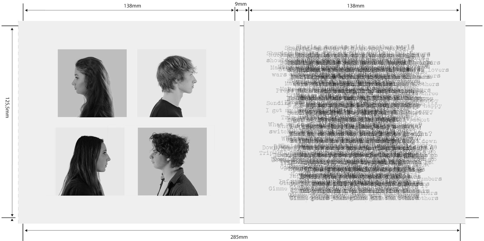
The outside of our album cover

The outside of our album cover
Front of Our Digipak

Digipak

Digipak
The Inside of Our Digipak
Our website, please click on it to access.

Monday, 12 October 2015

R&P Post 19: My influences and vision for the project

In preparation for our music video we all did individual research and came together to create a moving image 'pitch' of our ideas, referred to as a steal-o-matic.


Goodwin stated that music videos always demonstrate genre characteristics which I thought was very important when looking for influences, as seen below.

Opening shot:
It's a common theme within rock and alternative bands to begin their music videos with an opening shot of the band members coming on to set and/or getting ready.

This also allows the audience to become familiar with the band and associate different members with their instrument and persona.

Establishing and master shots:
By cutting away to the cyclorama it sets the scene and begins to introduce our concept of technology slowly taking over although it firstly raises questions in the audience's mind such as 'where is this?' and 'why is the paper moving?'.
These shots reflect our infinite white background that we want to create in order to create an atmosphere of isolation and the second shot shows a male singer alone which is what we want in our music video. 

Our conceptual shots: 
We have decided that in post-production we will use after effects to edit the stacks of paper moving up and down in rigid, rhythmic format - similar to the drums shown below. This will reflect the steady pace that technology is consuming us in and as Luke will seem unaware of the papers moving around him it will also demonstrate how we are immune to the effects. 
Our other conceptual aspect is the face paint, hence why we have included different shots representing artwork done on the face. The shot on the left is a visual demostration of how the face can be used to evoke drastic emotions from the viewer as it is quite an unnerving shot, especially for a music video. On the right is the kind of style and look we are going for witht he face paint as we want the look to be very pristine and solemn. 
In between all of these shots we will constantly cut away to the performance which is taking place on a rooftop so the shot included of Matty Smith playing an accoustic song on a rooftop demonstrates the idea we are going for however our style will be a lot more edgy and we will consider putting it into black and white in post. 


Chorus: 
The chorus will be filled with fast-cuts as Vernallis says that the editing will match the beat and be very obvious so as to draw attention to itself. It will also include angry performance and conceptual shots so that the audience can be drawn in and emphasise with our lead singer. The paper stimulation we have placed in our steal-o-matic is a visual representation of how gradually throughout our video, Luke's anger will escualte until he can't take it anymore and ends up throwing and kicking paper around everywhere. 
The shot of the band performance really demonstrates how the lead singerof Nothing But Thieves throws himself into the song just like how we want Luke to do.  

Sunday, 11 October 2015

R&P Post 18: Analysis of my track's lyrics and instrumentation.

During one of our group's meetings we sat down and analysed the lyrics in detail which was particularly helpful as we were able to bounce ideas off of eachother. Below is our work on them.

We found that technology was a recurring theme for this song and it revolved entirely around the power and obsession people have for technology so we would like to play on this idea. 
Our mood board.
We created a mood board to brain storm all our ideas and try and put them together to create a music video idea. Creating a mood board and analysing the lyrics was beneficial as we were able to visualise our ideas and put them down on paper for us all to see whether we agreed on them or not.


R&P Post 17: My Chosen Track

My group all really enjoyed the track Tripswitch by Nothing But Thieves and all agreed on the ideas about technology that we posed for our music video. This meant that we could look into Reception Theory when creating a music video as the use of technology within the lyrics meant that we could make an ambiguous music video that would appeal to, and be interpreted by, a large range of audiences.


Below I have created a pro and cons table for our music video choice.
We found out that the track was owned by a record label owned by Sony Music Entertainment Limited UK and then decided to send them an email requesting permission to use this track and from their lack of response we have assumed it is ok to proceed.

R&P Post 16: My Band or Artist

We decided to create a band called Come What May, consisting of two boys and two girls. They are an alternative rock band who are very upcoming and egdy. They are all in their late teens and early 20s. This name was derived from a British idiom which suggests that we are fearless and ready to face our fate. This meets the needs of our TA as it gives them confidence and helps them understand our band's values and outlook. These semiotics will appeal to alternative rock fans during our marketing. We also followed convention similar to other rock bands such as Sleeping with Sirens and Pierce the Veil as we chose a band name that could be easily abbreviated.
Inspiration:

Tonight Alive and Paramore are two of the most popular rock bands in the UK and are lead by females.

Our band will have very post-modernist views in order to make the audience question social norms. We aim to use this as a branding technique as similar bands and artists that I have looked at, such as Kurt Cobain - one of the most famous rockstars ever - challenged societies views on things such as feminist stereotypes. This is a counter-culture approach, therefore making it easily marketable and appealing to alternative rock fans. 
I asked 4 different people of ages ranging from 12-18 years, some questions about our band.

Q) Do you like the name? All 4 said yes. 
- However the 12 year old was unsure of the meaning behind it but I explained that we like it as it was like an acceptance of fate. 
- The 16 year old said she liked it as it was easy to abbrieviate to CMW as similar rock bands do, such as Sleeping with Sirens. 

Q) Do you like our costume style? They all said that this was what they expected for a typical rock band. 
- One of them suggested having some colour co-ordination between the members which I think is a good idea.
- They all liked the contrats between Amber and I as we would not clash and they thought it gave us more band identity by not being too similar.
- The 18 year old suggested Seb wear something slightly more colourful.

Q) What do you think of having two female guitarists? 
- 'I've never seen a band with a female in it who isn't singing so it should be interesting.'- 15 year old.
- The 12 year old didn't think much of it at all, which is exactly what we want from our audience.
- 'I think they should both be really tomboy-ish to challenge girly stereotypes!' However I disagree with this idea as it doesn't connote our post-feminist attitude that we are trying to connote.
- 'I love it! It's so different and cool, like a really modern band would be!' - 18 year old. 

R&P Post 15: My Record Label

After researching independant record labels such as Rough Trade and Marshall Teller, we have decided to call our record label 'Intrepid Records' as we thought this was quite simple and punchy. Many of the record labels we looked at had 'records' in their title, such as Picaddilly Records
As seen from the image above, Intrepid means 'fearless' and 'adventurous' which I believe connotes our band's image well as we are very head-strong and confident. This also has positive connotations for our audience as they will be influenced in a positive manner - to be more confident and brave. 
Intrepid is also occasionally used comedically in order to have a satirical effect which reflects our band's approach to their music. Although our record label is not heavily advertised it helps us conform to Dyer's star theory as our record label helps portray our band's identity.


We created a compass as it reinforced the representation we were trying to create of a sense of adventure and finding one's self. This follows Blumer and Katz's gratification theory as it helps the audience gain personal identity. 

We also chose to create this label as it was inspired by symbols called glyphs. 


We combined a range of them to give our record label a deeper meaning and have an alternative, indie feel. This simplistic style is very similar to other record labels, such as Fantasy and Structural Damage Records (both below).
We decided that we would create our own minor, independent label as I have previously researched similar labels such as Rough Trade so I was aware of how they operated. 

Below are some alternative rock bands which are similar to the kind of bands that our record label would represent. We would predominantly represent new and upcoming rock bands.


R&P Post 14: My Target Audience

We have decided to have as large an audience as possible, particularly becuase we are promoting a debut artist/band. Our research showed that rock was one of the most popular genres of music, with a huge fan base and many big artists within the industry.

Our  primairy target audience:
- Fans of the rock genre which will have a wide reach, more specifically alternative and indie rock. 
- Aged 15-30 - Maslov's hierarchy of human needs is applicable to this age demographic as they are stereotypically at the peak of their social life as they have lots of friends and often bond over their music tastes, in this case alternative-rock. 
- Both genders as our band is very neutral - 2 boys and 2 girls. 

The majority of alternative rock fans are male, possibly because the majority of artists and bands are male. However, from this research it is evident that there is still a stong female following of the genre. David Morley's audience theory can be applied here as audiences have a 'preferred' reading that they want male-orientated artists as potentially they are better rock artists. However, rock bands such as Tonight Alive and Paramore challenge this idea as they have huge fan bases - both male and female. Our aim in creating a gender neutral band is to appeal to both audiences and connote gender equality. 

Our secondary audience:
- Our secondary audience would also consist of older, nostalgic rock fans.
- Aged 30+ 

Our tertiary audience:
- Fans of the pop genre who are searching for more may like our song and music video.

Below I have created a short video with some of our target audience saying what their music preference is and what they look for in a rock band. 

Using this feedback, I discovered that..
- the rock genre has fans from all different age groups. 
- All of the people I questioned said that the outfits were important, one saying that she looks for 'beanies and skateboards', a common cliche for rock bands.
- The 14 year old also said that he expects a rock band's music video to cut back to performance clips. 

Sunday, 4 October 2015

R&P Post 13: Influences and inspiration from art, fashion and culture

I have been influenced by many different sources and time periods.

Artistic Director -  Wes Anderson:
I really like Wes Anderson's artistic style used his films via his use of symmetry. I would like to use this in my music video to make it very conceptual and to symbollise aspects of our video. For example, with the paper I would like the piles to be symmetrical and move in time with one another.

Classical vs Modern rock:


The sounds of rock music are still vaguely similar, however the content within the lyrics has changed greatly and many critics, such as Kalista Ailae, suggest that the lyrics are now too hateful and angry. 

I personally really like modern rock and think it is perhaps a bit of a 'State of the Culture'. In this current day and age, the culture is all about rebelling against authority and being an individual which means that modern rock will never die out so long as the lyrics and music are always relevant. I will therefore make sure that we exploit the meaning behind the lyrics of the song we choose and develop them visually. Following Stuart Hall's theory, this will leave our music video open to multiple interpretations and allows it to gratify our audience in a variety of ways. 

Fashion and style:
Looking back at older rock artists, particularly bands like Kiss, I have realised they were a lot more expressive with themselves. 
Whereas bands like All Time Low are a lot more ordinairy and relatable to their target audience of younger teenagers. 
I would like my band to be slightly edgier than All Time Low but I really like their casual, nonchalent aura. David Gauntlett says that 'identity is seen as more fluid and transformable than ever before' which allows us to experiment with our band's image and characteristics. 

Film Noir:
Film Noir influenced me drastically as I had researched it in detail for my AS project and thought it could be used again to create an eerie, cool music video.
Beat The Devil directed by John
Huston
Goodwin stated that media texts often have intertextual references and so I decided to look into the most common and easily-identifiable conventions of film noir. The black & white style seemed to be the most important aspect of film noir and I really like how Directors are able to enhance the message behind their films by decreasing the saturation and having little to no colour.  

R&P Post 12: Artists/bands that have influenced my ideas

I have predominantly researched and analysed alternative and indie rock bands, however almost all the mixed gender rock bands I could find had the female as the singer but I still think their styles are very influential.

Paramore:

I think that our band should be dressed similarly - in dark colours but I really like the red contrast so perhaps we could incorporate this into our colour scheme and attire. However, I think that if we are to include sex appeal we should try to do it subtly so that it is not the focus of our band's appeal. We will also include small generic signifiers such as tattoos on the arm or an earring for the drummer. This will help our band stand out and allow our audience to easily identify with them as our TA often like to stand out from the crowd, hence their interest in rock music. 

Tonight Alive:

I really like the gender equality and post-feminist aspect that Tonight Alive convey and would like to do something similar with our band by not over-sexualising either genders and having them portrayed as equals through our promo shots and album cover. 

A Loss for Words:

The juxtaposition between these two shots have inspired me to make sure that we include fun aspects of our bands, for example we could place photos of us pulling faces and laughing in our gallery on the website. This will help to create a bond and 'personal relationship' between the TA and band, allowing them to get to know and like the band - thus they will buy more of our products. 

Sound..

Almost all of the rock bands I have researched have a similar sound and use similar instruments often including; guitar, bass, drums and a singer. 


The singer is usually at the fore-front of their image but we are considering have a 4 member boy/girl group with the male as the face of the band but the females are also represented as equal to them, like Tonight Alive have done. 

Performance..

The bands I have looked at for their performance often focused greatly on the singer but had many cut aways to the other band members, more so than in pop videos as in rock I found that more attention is given to the instruments. The instruments are used as symbols and shots of them are conventions of the genre.

Against the Current used a flickering effect in their music video and their style was very monotone as the background is white whereas their attire and isntruments are black. I really like this monotone effect and would like to use it in my own music video.


Pierce the Veil often cuts from a group shot to the lead singer and then to each of the other members in turn and the layout of their setup creates symmetry within the band as both guitarists are on either side of the singer with the drummer central but behind them all. I would like to create this same effect with our band but using gender also so that the two females are on either sides of the frontman. 


R&P Post 11: Artist websites that have inspired and influenced my ideas.

I have looked at and analysed a variety of different websites to influence my own ideas for conventions my website should contain.

Some of the websites I looked at.
Conventions:
- All the above websites have 'merch' or 'store' on their homepage, with the exception of Beyonce. I think this is tactical as it financially benefits our band and helps increase profits as one of the first things the audience will see is an opportunity to invest in our band's products.
- Their music videos are all clearly advertised as one of the first things you see when entering their web page. I will make sure that our website does this as it immediately allows the audience to see our latest production and allows the audience to find a temporary diversion from their lives.

- Gigs, tours & events clearly advertised. This is any band's biggest form of profit as it gratifies the audiences in many ways according to Bulmer and Katz as they are given an escape from working whilst creating relationships with others of similar music tastes to theirs. Therefore I will make sure that Tour dates are clearly advertised ont he Home Page of our website.
- All websites include links to other social media, such as Facebook and Twitter. We will include links ot all our social media at the bottom of every page on our website as with the proliferation of technology most - if not all - of our target audience will be on social media. This allows them to interact with our band and share our content with their friends, thus raising publicity.
- Photos of the artists are included on their websites. This helps create their image and build their brand. We will also do this, I would like to have a Gallery page and Videos page which will help create personal relationships between our band and our audience.
- Each website has the option to sign-up for extra news letters and bonus features. This gratifies audiences and I will make sure this is clearly advertised on our News or Home Page.

Function:
- To promote the album and advertise current and upcoming music.
- To create a brand and style.
- Keep fans updated and connected.
-To inform the audience about logistics and other information.
- Interactivity.
- Maximise the opportunity for the audience to spend cash on the website.

Style & design:
What I have observed is that the more modern websites are more similar to blogs and have been updated for different platforms. However, Arctic Monkeys and Flight of the Conchords are more standard and easy to use. As shown below, Flight of the Conchords website is much more linear and simple to use. I think this will appeal to a wider audience so will probably follow this style.
I have also realised that the websites must reflect the artist and their music so branding is very important in terms of the style and design of the website. 

After having looked at these websites I decided to look into a website that was more similar to the genre I am planning on creating a music video for.


For my own website I will make sure I follow all the above conventions and include the functions I have listed above. The p!atd website has helped influence my style and theme for my website and I know that I want it to be quite alternative and predominantly black and white.

R & P post 10: Album covers that have inspired and influenced my ideas

From this task I have learnt that album covers can be catogorised in a variety of ways;
- By genre, rock tends to be a lot more edgier or in black and white, for example U2.
- Whether the focal image is of artwork or of people, following on from this is the artist in a band or solo?
- This also leads me to consider the media used-animation, photography, artwork, graphics etc. 

My group looked at a range of album covers to broaden our knowledge and understanding of what they often consist of. 

As our album is the first album we will include a photo of the artist on the cover as this is very common with debut albums. 

Artwork is also very common with alternate genres and I like the idea of collaboratign artwork with photography like Prince has done below. 


R&P Post 9: Music videos that have inspired and influenced my ideas.

There are many music videos that I am influenced and inspired by for my own music video.

A very influential video for me would be 'Not on Drugs' - Tove Lo. I decided to research a few more of her videos but found that 'Not on Drugs' was the most influential.


The song's music video finds Tove Lo performing the song in a white room filled with colored smoke bombs and various computerized animation. "I choked on the paint, the smoke made me half blind and here is my three-minute trip that shows the intensity and weirdness I feel when falling in love," she told Rolling Stone.

Conventions followed:

  • Lip syncing
  • A range of editing techniques 
  • Artists appears in the video
  • It's predominantly a performance video
  • She changes costume for different scenes
  • Editing matches the pace of the video
  • Lyrics and video match
Audience:
  • Video is fun, colourful & bright - attracts a younger audience. 
  • She is alone in the video - allows the audience to feel connected with her. This also makes her appear in control and strong which is inspiring to young girls. 
  • Lyrics are all about love & close-ups are used to convey her emotions - very relatable.
  • Pop song with a lot of recurring pink colours - stereotypically a female-orientated genre.
  • Most of her costumes are quite revealing like tight skirts and dresses - sex appeal to attract males but also influences her female audience. 
The video begins by tracking Tove Lo into an unknown place that looks like a studio but we are not yet able to distinguish the setting. 
A variety of shots are used throughout the video, ranging from close-ups to long shots and zooms in order to keep the video interesting and enjoyable. This also creates a disorientating effect for the viewer and alludes to the drug references. 

Fast-paced editing is used throughout the video and in the chorus alone there are 33 edits used, demonstrating just how fast the editing is. 

This disorientated effect is reinforced by the large variety of settings, such as the warehouse to the side of the road, which keep the viewer captivated. 
I particularly like the effects used in this video, as seen above flickers are used and special effects to rewind the video so it appears that the dust is being placed back into the pot. 

A connection I spotted with this video and Astrea was that both videos used colours to their advantage and used red and blue to contrast with each other. I found this really dramatic and interesting as it could possibly symbolize two opposing sides coming together. 

Laura Mulvey's Gaze Theory:
  • The music video doesn't focus on the curves of her body or sexualise Tove Lo which is quite unusual for a pop video. 
  • However, she is seen wearing skirts and crop tops which still give the music video sex appeal. 
  • This may have been a conscious decision made by the artist as her fan-base is very young.