Introduction to me

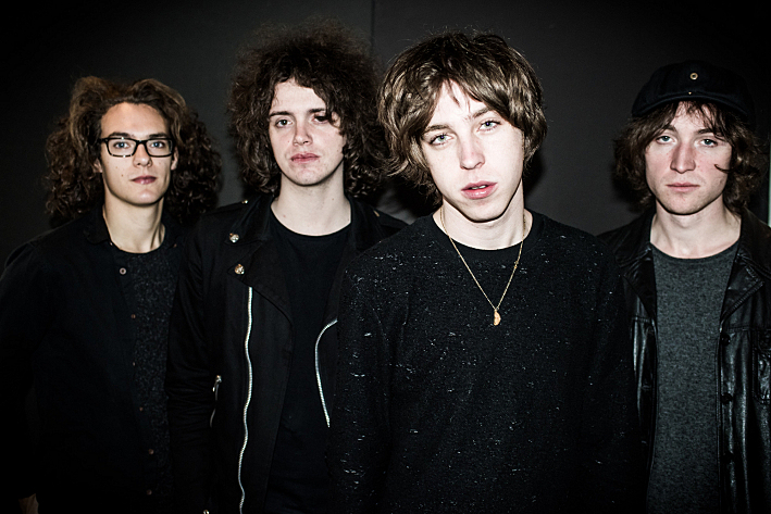
My name is Shayam Utting, 9163, and I am in group 1 with Amber Mota, 9114, and Alistair Price, 9137.

To navigate your way around my blog, please use the labels below; A2 Research and Planning, A2 Construction and A2 Evaluation.


'Trip Switch' by Come What May

The outside of our album cover

The outside of our album cover
Front of Our Digipak

Digipak

Digipak
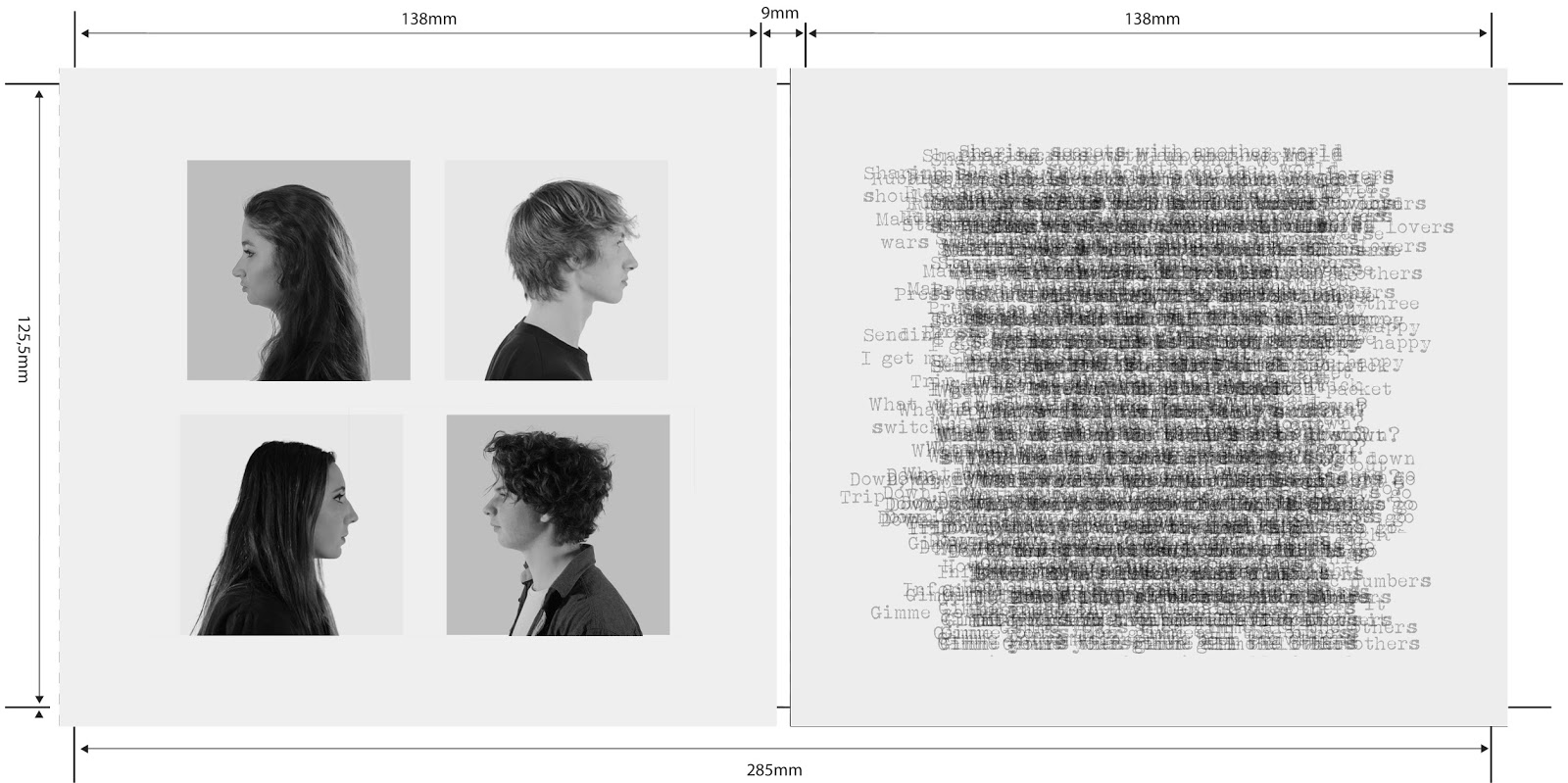
The Inside of Our Digipak
Our website, please click on it to access.

Tuesday, 1 December 2015

R&P Post 25: Costumes, Props & Make-up

Costumes, props and make-up can make all the difference in production and are crucial when creating representations of our characters, in particular Luke. Amber created some visual documents so that we were able to visualise how we wanted our band members to look and to ensure that our costumes work symbiotically with our band's image.

We thought that this look was quite under-stated and simple which matches are band's nonchalent attitude. However, originally Luke was wearing a plain grey t-shirt but after looking at other bands, for example Bring Me The Horizon shown on the right, we thought that a bolder t-shirt would work better. Our video was going to be in black and white so colour did not particularly matter but we thought a strong white pattern would create more contrast.

When asking our target audience, I found that all of them noticed the t-shirt first in Luke's outfit as it stood out and had a very unique pattern on it. 

Amber and I were purposfully dressed differently to reflect our different personalities. The beanie had a more grungy, skater-girl effect - during my research interviewing our target audience this was an expected convention of a rock band. We decided that we should try and colour co-ordinate our outfits to create a sense of synergy so we both wore red chequered shirts but with different tones and in different ways - mine was tied up and Amber's was worn under a denim jacket. Following on from my research, I found that Vans was a very typical skater brand so I therefore wore vans which our audience will identify with counter-culture.

We decided to dress our drummer in predominantly black so that he fit with our band image and also didn't look odd in comparison to the rest of us. Leather jackets are a convention for rock bands, in the image of Lost Prophets (to the left) two of the members are wearing leather jackets. Our target audience really liked this outfit but when we suggested that perhaps I should wear one also they thought it may be too over-powering and look too similar to Seb.

R&P Post 24: Planning my Digipak Panels

After planning our website, we realised that we would need to plan our digipak.

I made a list of some common conventions that I have found:
  • Often display the artist or band name either above or below the album name.
  • Leading on from that point, it is a convention to have the album name clearly on the front and on the spine. 
  • Song list on the back cover of the album. 
  • The bar code is always displayed, usually ont he back, however in some cases it is on the front.
  • All the institutional information is often next to the bar code. 
Throughout all of our designs we have included images of our band members on the digipak as this is important to create a bond and personal relationship (Blumer & Katz) between the audience and the band. 

Our first design:

Our aim was to create a design that was nostalgic of the 60's pop art style and we thought that this was a unique twist that would be quite unusual to find on album covers. However because of this infamiliairty we thought it may not appeal to our audiences. We have not completely disregarded this idea and may potentially put it in the inside of our digipak. 

Our second design: 

Many other albums that I looked at used brick walls, ranging from hip-hop to rock. We thought that the brick wall would create an edgy but conventianal generic signifier for our band. The hearts were used to compliment our original album title; 'The Honeymoon Is Over'. We weren't completely convinced of this idea though as it seemed slightly too generic, this lead me to create another flatplan for the album working with another theme which our target audience liked; static. 

Our third design:

This was meant to show a band shot, split between 9 different TV monitors. Our background would be static and we decided to stick with our original idea of including profile shots in the inside. Our song names, band name and album title would all be in block black boxes so that they were easily distinguishable from the static background.
After looking at Nirvana's digipak panels I realised that our theme did not have to be as rigid as I initially thought and that we could play with our theme so long as we could explain why and that it would still apply to our target audience. 


I then decided to look at U2's digipak which influenced me heavily. 


I may look into and play around with the block writing style for the back of our album cover, or even the inside. I really like the black and white style and will definitely incoporate it in my album cover as this has been a popular theme throughout the history of the rock genre. I also like their profile shots seen in the inside of the case. 

R&P Post 23: Planning my Web Pages

Websites are very important when gratifying the needs of audiences as it allows them to develop their view on our band and find out more information about them.

We initially drew out flatplans for our website using pen and paper but decided that online copies would be much more effective. Having researched websites before we already had some ideas of what we wanted on our website but in my further research I found that it is very common for music band websites to have a banner. As  shown below, Red Hot Chilli Peppers have a very simplistic banner but next to it on the left is there easily recognisable logo.
Cute Is What We Aim For are an alternative, indie band with a very linear website, similar to a blog where the pages overlap and you can scroll through one after the other. As we want our band to be very modern and upcoming, we may follow witht his idea of our website being quite similar to a blog and all features interconnected throughout the website.
Below are the templates that we created and I think the synergy between each page is quite evident, from the black back ground to the font within the header. 

This black and white theme was very similar to Katfish and the Bottlemen and Arctic Monkeys. We chose it as it was clearly popular with our target audience and was a great generic signifier. 
After creating the homepage, I then decided to compare our flatplan to Cage The Elephant's hompage. 

  • Our video page was created so that the audience could interact with our website in a free and easy manner. We decided that we would create the website so that it had multiple videos on the page as opposed to just one, thus being distinguishable from our homepage. 
  • Our gallery page will consist of images from our performance shoot on the rooftop, our promo shoot, our paper scenes and behind-the-scene photos. This allows the audience to take a more personal approach to our band. The style of a collage is very quirky and easy to use. 
  • Our tour & merch page allow the audience to spend their money and buy into our products. We therefore provided our TA with multiple different opportunities to do this; multiple tour dates for different venues across the UK, keyrings, t-shirts etc. 

R&P Post 22: Planning my Promo Shots

For our digipak and website we would need to have a photo shootso that we had material to edit and include. We therefore decided to draw some promo shots - some with the whole band and some individual shots.

This is a standard promo shot of the whole band standing and is very common within the indie genre, such as bands like The 1975 who are all seen standing in a line with the lead singer, Matt Healy, standing in the middle and slightly forward. This then inspired me to try and include a range of shots in this format, including..
The 1975
1) A traditional shot with us all in a straight line and blank facial expressions.
2) A shot of us in two staggered lines, possibly pulling different expressions to one another however we will have to experiment on the day to see what works best.
3) A shot with Luke standing slightly infront of us to demonstrate that he is the lead singer of the band. I think this shot will be the best when trying different expressions as we can create a contrast between Luke's expression and the rest of the band members.
These shots will be crucial for our website as it is the most generic and familiar to our target audience.


This shot will be much tighter so that it is more personal and allows our target audience to see our facial expressions more clearly. This will allow us to portray our different character personas via our expressions and style, for example Luke's messy hair connotes playfulness and my winged eyeliner has flirtatious connotations. However our positions have changed so that we are now sitting on the floor.

Catfish and the Bottlemen
We will make sure to try out multiple different expressions, a definite would be moody expressions, as seen to the left, seems to be a common convention and would also reflect our band's image well. We will also have shots where we are all laughing and smiling to use on our website or possibly for the inside of our digipak as it is much more intimate and creates a differrent perspective for our band.

Having our band sitting on the floor is another common convention for indie/rock bands as it often portrays their moody,
Tonight Alive
care-free nature. The change in the band members' sitting positions also reflects their different characters.

My only concern is that shooting these shots against a whit backdrop may pose difficult to get us looking like we are slumped and tired as we can not lean against the back drop. However I think that if body language is right this won't be an issue.


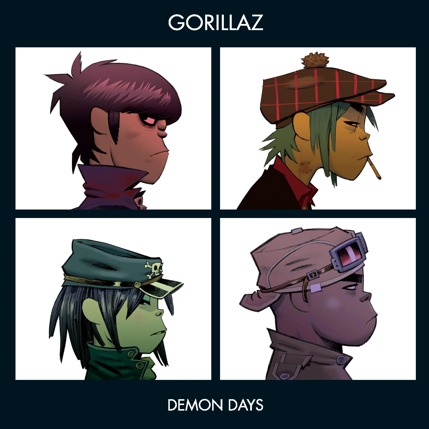
We then decided to create profile shots of the band as in the early weeks of production Alistair and I were looking at the Gorillaz album cover and thought this could create an interesting effect if we were to replicate it.
Side profile & face on
Gorillaz - Demon Days

R&P Post 21: My Key Shots Storyboard

We decided to break down our ideas further into specific key shots for each section as the timeline will be very useful for keeping track of timings and shots but we decided we would like a visual representation of our music video.


I created the story board using paper and post-it notes and decided to colour-coordinate the shot types.


To the left is a picture I took of the first section of our story board, it begins with a long shot of the band members walking on to the set on the rooftop and cuts to a mid shot of Luke singing.
Myself working on the
storyboard. 


We also included extreme close-ups of Luke's eyes and pans to add more movement and for dramatic effect.

I found this incredibly helpful to create as I was able to visualise the variety we had in shot types and make sure we had a wide enough range of close-ups/mid shots and long shots. This also made creating a shootboard a lot easier as we were able to refer to the storyboard and when we edit our test shoot we will have a clear idea of what we should be doing.

R&P Post 20: My Music Video Timeline

The steal-o-matic was very helpful to create in order to pin down our creative ideas and visual references, however we decided that we needed more structure and order when planning our music video. We therefore made a list of all aspects of our song in accordance to timings, as shown below.

00:13 - 'Sharing secrets with another world..'
00:24 - 'Trip Switch'
00:29 - 'Make a wish..'
00:40 - 'Trip switch'
00:45 - CHORUS
00:56 - 'Down, down, down'
01:12 - 'Gimme data'
01:23 - 'Trip switch'
01:28 - CHORUS
01:39 - 'Down down down'
01:50 - BRIDGE INSTRUMENTAL
02:01 - 'They put out the lights'
02:12 - CHORUS
02:23 - 'Down, down, down'
02:34 - CHORUS
02:44 - 'Down, down, down'
02:55 - 'Down...'

We then created a timeline on the computer to make this easier to see and visualise how long each section was.

I found that creating a timeline was very useful as it raised issues that we would not otherwise have encountered until filming, for example we realised that the first verse was the longest section of the song so needed the most shots to fill it with. In order to process our ideas further I think we should create a storyboard to help us visualise our ideas. 

Monday, 12 October 2015

R&P Post 19: My influences and vision for the project

In preparation for our music video we all did individual research and came together to create a moving image 'pitch' of our ideas, referred to as a steal-o-matic.


Goodwin stated that music videos always demonstrate genre characteristics which I thought was very important when looking for influences, as seen below.

Opening shot:
It's a common theme within rock and alternative bands to begin their music videos with an opening shot of the band members coming on to set and/or getting ready.

This also allows the audience to become familiar with the band and associate different members with their instrument and persona.

Establishing and master shots:
By cutting away to the cyclorama it sets the scene and begins to introduce our concept of technology slowly taking over although it firstly raises questions in the audience's mind such as 'where is this?' and 'why is the paper moving?'.
These shots reflect our infinite white background that we want to create in order to create an atmosphere of isolation and the second shot shows a male singer alone which is what we want in our music video. 

Our conceptual shots: 
We have decided that in post-production we will use after effects to edit the stacks of paper moving up and down in rigid, rhythmic format - similar to the drums shown below. This will reflect the steady pace that technology is consuming us in and as Luke will seem unaware of the papers moving around him it will also demonstrate how we are immune to the effects. 
Our other conceptual aspect is the face paint, hence why we have included different shots representing artwork done on the face. The shot on the left is a visual demostration of how the face can be used to evoke drastic emotions from the viewer as it is quite an unnerving shot, especially for a music video. On the right is the kind of style and look we are going for witht he face paint as we want the look to be very pristine and solemn. 
In between all of these shots we will constantly cut away to the performance which is taking place on a rooftop so the shot included of Matty Smith playing an accoustic song on a rooftop demonstrates the idea we are going for however our style will be a lot more edgy and we will consider putting it into black and white in post. 


Chorus: 
The chorus will be filled with fast-cuts as Vernallis says that the editing will match the beat and be very obvious so as to draw attention to itself. It will also include angry performance and conceptual shots so that the audience can be drawn in and emphasise with our lead singer. The paper stimulation we have placed in our steal-o-matic is a visual representation of how gradually throughout our video, Luke's anger will escualte until he can't take it anymore and ends up throwing and kicking paper around everywhere. 
The shot of the band performance really demonstrates how the lead singerof Nothing But Thieves throws himself into the song just like how we want Luke to do.