This is a standard promo shot of the whole band standing and is very common within the indie genre, such as bands like The 1975 who are all seen standing in a line with the lead singer, Matt Healy, standing in the middle and slightly forward. This then inspired me to try and include a range of shots in this format, including..
| The 1975 |
2) A shot of us in two staggered lines, possibly pulling different expressions to one another however we will have to experiment on the day to see what works best.
3) A shot with Luke standing slightly infront of us to demonstrate that he is the lead singer of the band. I think this shot will be the best when trying different expressions as we can create a contrast between Luke's expression and the rest of the band members.
These shots will be crucial for our website as it is the most generic and familiar to our target audience.

This shot will be much tighter so that it is more personal and allows our target audience to see our facial expressions more clearly. This will allow us to portray our different character personas via our expressions and style, for example Luke's messy hair connotes playfulness and my winged eyeliner has flirtatious connotations. However our positions have changed so that we are now sitting on the floor.
| Catfish and the Bottlemen |
Having our band sitting on the floor is another common convention for indie/rock bands as it often portrays their moody,
| Tonight Alive |
My only concern is that shooting these shots against a whit backdrop may pose difficult to get us looking like we are slumped and tired as we can not lean against the back drop. However I think that if body language is right this won't be an issue.
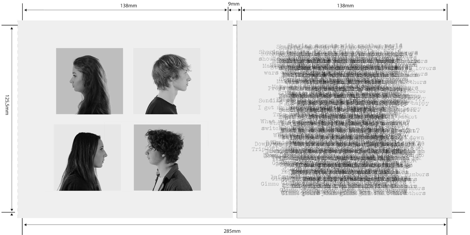
We then decided to create profile shots of the band as in the early weeks of production Alistair and I were looking at the Gorillaz album cover and thought this could create an interesting effect if we were to replicate it.
 |
| Side profile & face on |
| Gorillaz - Demon Days |


No comments:
Post a Comment