I screenshotted our Adobe Premiere Pro and below is my annotated photo of all the different features, demonstrating how easy and efficient this software was to use.
After having put everything onto our sequence we began experimenting with black&white for our performance shots to match our band's identity and look less plush and more indie. I then asked our target audience and also our teachers for their opinions. Below is a pie chart I created to show the outcome.
 |
| Our feedback pie chart. |
From this we discovered that about 85% of our target audience preffered our music video in black and white so we decided to stick with this idea.
 |
| Alistair and I at the edit suite. |
Our solution:
- We decided to only edit one or two of these shots with this effect.
- We placed it on some of our more dull shots nearer the beginning of the sequence.
- We also used shots from a low angle to place the paper moving on as we thought it showed more skill and was more intersting visually.
I then interviewed three more people to see what they thought of the progress of our music video.
From this I realised that our genre was connoted very well as everyone I asked knew that we were an indie/rock band. One of my interviewees particularly referenced the walk in at the beginning.
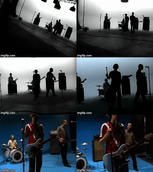
 I was particularly influenced by Weezer - Undone as they had this convention and also used black and white initially. We were also prized on our fast-paced editing that was 'always to the beat' so I realised that we could use the beat of our song to our advantage in order to make our video more interesting - supporting Vernallis' editing theory. However, we had to be careful to not let this editing get to repetitive by sticking to the beat.
I also decided to interview my grandparents, despite not being our target audience, and there main points were..
- Our video looked very proffessional and they loved the black and white.
- Our acting was very good - they were shocked that we weren't all in a real band!
- Their main critisism was that the chorus was too fast-paced.
This then inspired me to create an online survey to allow people of a variety of different ages to review and critique my music video.
I was quite surprised by the results as the black and white scene was not as well received as we had anticipated. 53% of the people taking the survey said that it doesn't always look like they work together. When asked to specify why, a common recurring theme was that there was 'too much' black and white and it was not high contrast enough. This led me to grade the paper scenes again and try to see if there were ways we could get the two scenes to fit better.
A downside was that not many people grasped the concept we were initially aiming for with technology taking over and having a massive influence in our lives.
I think the reasons for this were..
- We focused too much on the paper - a traditional form of work.
- The only use of technology we had was the laptop which was only featured in the first chorus before being slammed shut.
- The wires were not representative enough of technology.
- Following on from this the bokeh detracted attention from Luke being strangled.
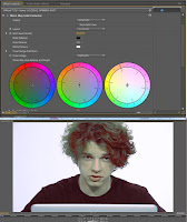
 After placing every shot in the timeline and deciding we were all happy with it we decided to do our grading. We used Procamp to adjust the brightness, contrast and saturation on all our shots. We also used three-wheel colour corrector for our paper scenes in order to dramatically reduce certain colours. For example in many of our shots Luke was incredibly orange. To the left I have shown a very exaggerated example of what these two tools can do. I found them very easy to use and they made the grading process very quick.
Another problem then arose when our group had a conflict of what grading we would like to use on our paper scene shots, especially after receiving the feedback, previously mentioned, from our online survey.
 |
| Left; the grading we chose to keep. |
I found editing extremely exciting and really enjoyed this part of the task. I particularly loved editing the chorus' and liked experimenting with different and unusual shots. For example the shot of the paper in the final chorus I edited to speed up the duration to 300% and this worked really well in time with the music.
If I could improve anything about our music video I would have..
- spent more time on grading to try to get the black and white fit together better with the infinite white shots.
- Some of our lip-synching wasn't as precise as I would have liked it to be so I would have also made sure we spent more time on that.


No comments:
Post a Comment