Stereotypically, our youthful target audience have a preferred reading of image-based digipaks and this could connote the informality of our TA and show how important a creative digipak is to appeal to them. After finalizing our idea I reviewed the response from my online survey.
The majority of our answers suggested that there were no further changes to be made, however when asked to specify what they would improve some said that they were unsure of the writing as it was unreadable. Most of the comments were quite minor things, such as adding institutional information which we immediately did.
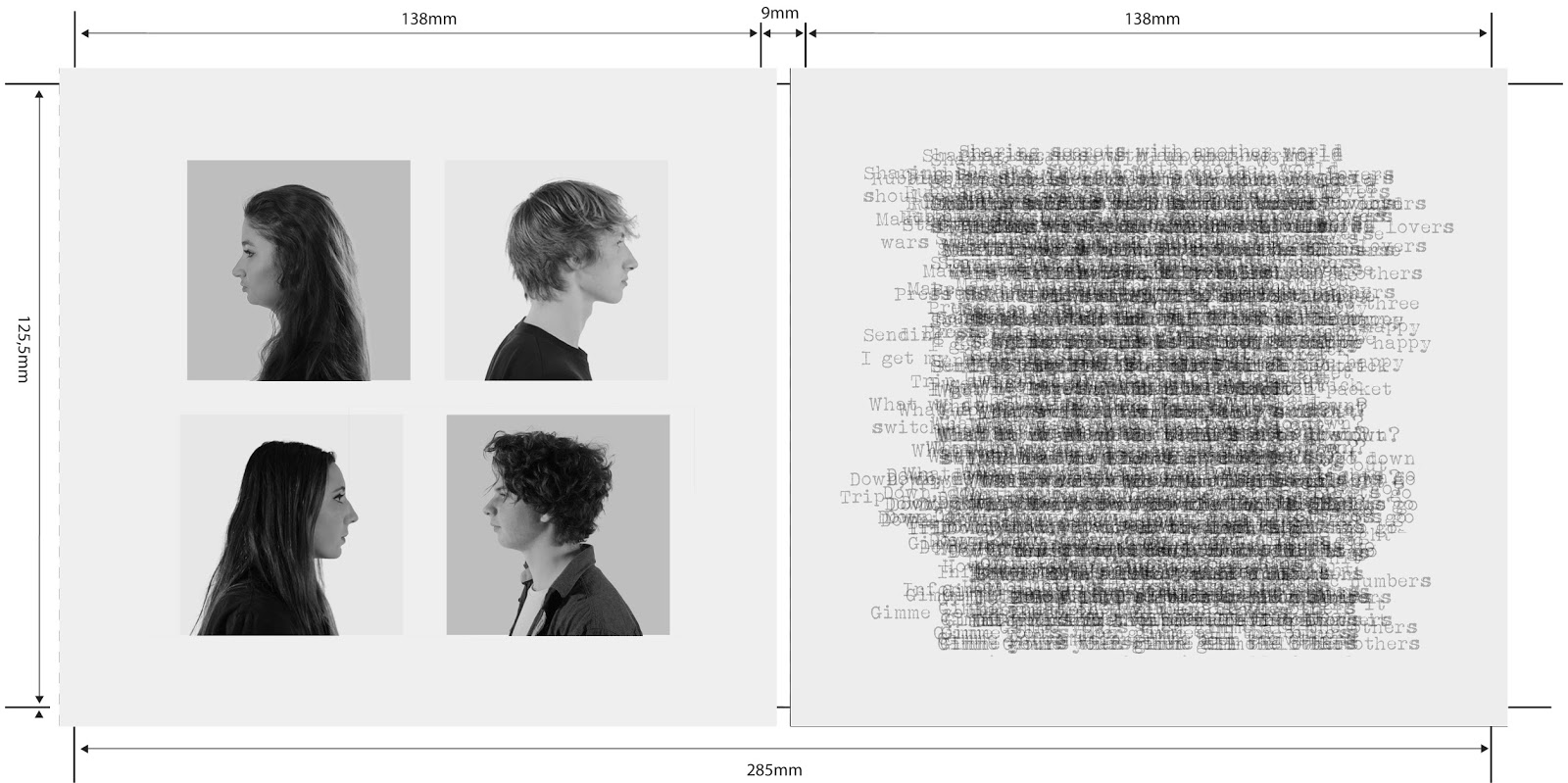
Here is our final digipak..
From my research for our album digipak I thought that the profile shots would look really good and connote our band well. We also decided that the right hand side of our case looked really interesting by overlapping the layers of text for the lyrics of Trip Switch. We were initially unsure of whether this would look too messy but after receiving feedback from our teacher, who said that the CD would be on top of this section anyway so it wouldn't be too readable, we decided to stick with this idea.
Despite how stressful this task was I think that after gathering feedback from our target audience and making a definitive decision to go with a static theme our album cover really came together and looks very professional.


No comments:
Post a Comment