

I made a list of some common conventions that I have found:
- Often display the artist or band name either above or below the album name.
- Leading on from that point, it is a convention to have the album name clearly on the front and on the spine.
- Song list on the back cover of the album.
- The bar code is always displayed, usually ont he back, however in some cases it is on the front.
- All the institutional information is often next to the bar code.
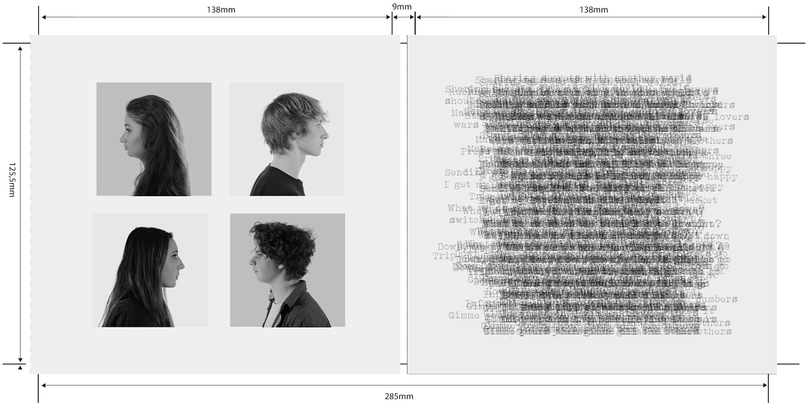
Throughout all of our designs we have included images of our band members on the digipak as this is important to create a bond and personal relationship (Blumer & Katz) between the audience and the band.
Our first design:

Our aim was to create a design that was nostalgic of the 60's pop art style and we thought that this was a unique twist that would be quite unusual to find on album covers. However because of this infamiliairty we thought it may not appeal to our audiences. We have not completely disregarded this idea and may potentially put it in the inside of our digipak.
Our second design:


Many other albums that I looked at used brick walls, ranging from hip-hop to rock. We thought that the brick wall would create an edgy but conventianal generic signifier for our band. The hearts were used to compliment our original album title; 'The Honeymoon Is Over'. We weren't completely convinced of this idea though as it seemed slightly too generic, this lead me to create another flatplan for the album working with another theme which our target audience liked; static.
Our third design:
 This was meant to show a band shot, split between 9 different TV monitors. Our background would be static and we decided to stick with our original idea of including profile shots in the inside. Our song names, band name and album title would all be in block black boxes so that they were easily distinguishable from the static background.
After looking at Nirvana's digipak panels I realised that our theme did not have to be as rigid as I initially thought and that we could play with our theme so long as we could explain why and that it would still apply to our target audience.

I then decided to look at U2's digipak which influenced me heavily.

I may look into and play around with the block writing style for the back of our album cover, or even the inside. I really like the black and white style and will definitely incoporate it in my album cover as this has been a popular theme throughout the history of the rock genre. I also like their profile shots seen in the inside of the case.
No comments:
Post a Comment